Power BI is a very powerful tool that will allow you to organise your company’s data in an easy-to-understand view. With Power BI, you can pull in data from a wide range of cloud and on-premises systems, to create dashboards that track the metrics you care about the most. You can even drill down into your data and (literally) ask questions about it.
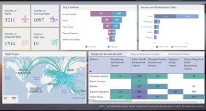
Deciding on what to include in your dashboards is vital for the successful use of this tool. The best use of Power Bi is not the total number of dashboards but how many dashboards are actionable and widely used. Elements that help to make your dashboards more actionable include content benchmarks, goals, real-time KPI monitoring, trends and performance. Some of these can be shown in the following graphic (click image to enlarge).
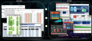
We are moving towards looking at data now as a motive for action. Therefore, it is vital to ensure the look and feel of what you see is engaging. The correct use of charts and metrics and the presentation of them makes a lot of difference as can be seen in the following example of where you may be and where you would like to get to (click image to enlarge).
When looking at using Power BI it is imperative to consider how the information is going to look on a small screen such as a mobile phone.
There is also a great feature in Power BI that allows you to use a natural language, for example, you can ask questions like “what were the sales numbers for the last month?”.
Today it is no longer about just presenting data. The emphasis is to give more importance towards actionable insights.
If you would like help in setting up a Power BI system, please contact us at Tycom.


